
There was a point when Chaos Booth looked finished enough to publish. The challenge flow worked, the app could build a collage, and I had even added editing choices for style, text and format. I could have stopped there. Instead, I looked at the result and decided that this was not the version I wanted people to meet.
This is the story of the Chaos Booth version I chose not to publish. It was not a broken build, a failed experiment or a screen full of placeholders. It was a functioning version with real ideas inside it. The problem was simpler and harder to ignore: I did not like the graphics enough.
A prototype that had become a real app
After getting the main challenge flow working in Unity, I began testing what happened after the final photo. Chaos Booth was never meant to end with four ordinary images sitting in a grid. The collage needed to feel like the punchline: a small visual story created from the poses, expressions and instructions that came before it.
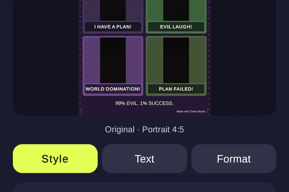
I used my own photographs to simulate complete sessions and see the experience as a player would. One of the early examples was Evil Genius, with four prompts—“I have a plan!”, “Evil laugh!”, “World domination!” and “Plan failed!”—arranged as a single result. It proved that the structure could turn separate photographs into one coherent joke.

The screen already included the actions I expected the finished app to need. I could edit the collage, save it to the phone or open Android’s sharing interface. The experience had moved well beyond a static mock-up. That made the next decision more difficult, because abandoning a design feels very different once it is already working.
More control did not automatically mean a better design
I also built an editor with three separate areas: Style, Text and Format. The Style tab could switch between looks such as Original, Comic Pop, Retro Booth, Meme Style and Neon Chaos. The Text tab allowed the collage title and individual photo captions to be changed. The Format tab offered square, portrait and story layouts.


On paper, that sounded generous. In practice, it created an important question: was I giving players useful freedom, or was I turning a quick party-photo app into a small design tool? Chaos Booth was supposed to move rapidly from prompt to pose to finished joke. Every additional choice risked slowing down that rhythm.
The editor itself was not the only concern. The dark interface, acid-lime controls, decorative borders and heavily themed collage backgrounds all worked individually, but together they did not yet feel like one confident visual system. The app had energy, but the graphics felt more assembled than designed. I could see the features; I could not yet see the identity I wanted.
The results were fun—and still not right
The most useful tests were completed collages. Drama Level 999! used a loud red stage-like background, while Rockstar Gone Wrong! placed the photos among guitars, spotlights and comic-style captions. These were not empty concepts. They showed that the challenge could produce a shareable result with its own tone.


Seeing those results on the phone was exactly what I needed. A design can look convincing while it is being built because I know how much work sits behind every button. A user does not see that effort. A user sees only what appears on the screen. Once I judged the app from that point of view, “it works” was no longer a good enough reason to release it.
Why I started again
I did not throw away the whole project. The challenge structure, camera flow, countdown, retake behaviour, collage idea and local My Creations gallery all remained valuable. What I rejected was the presentation. The mechanics had earned another visual attempt.
That distinction matters to me. Starting again did not mean the previous work was wasted. This unpublished version revealed which parts of Chaos Booth were genuinely fun and which parts were only technically complete. It gave me a real reference point instead of an abstract opinion. I could now say exactly what needed to feel clearer, faster and more consistent.
A working version can prove the idea. It does not have to become the version I publish.
I rebuilt the graphics again, and the third visual direction became the version prepared for release. The final app kept the humour and the four-photo storytelling, but presented them with a much more deliberate identity. As of 17 October 2026, that version is in the Google Play review process.
The next article will place the unpublished prototype beside the final Chaos Booth design and show what changed before the app reached Google Play.
Leave a Reply