
The most visible change in Gems of Luna is easy to spot in a before-and-after comparison. The earlier version had a colourful match-3 interface; the rebuilt project has an illustrated fantasy identity built around Luna, gemstones and three contrasting visual themes. But replacing a background was only one part of that work. The board, map, controls and reward panels also needed to look as though they belonged to the same game.
This article focuses on that visual transformation. I started from an existing Unity project, so I am not claiming to have created the original match-3 engine. The work here is the direction, replacement and refinement of the presentation around that foundation, with AI assistance for artwork and development.
A visual identity has to reach beyond the title screen
A new logo can introduce a different name, but players spend much of their time elsewhere: looking at objectives, reading counters, choosing boosters and returning to the map. If those screens retain an unrelated style, the new identity ends as soon as the opening screen closes.
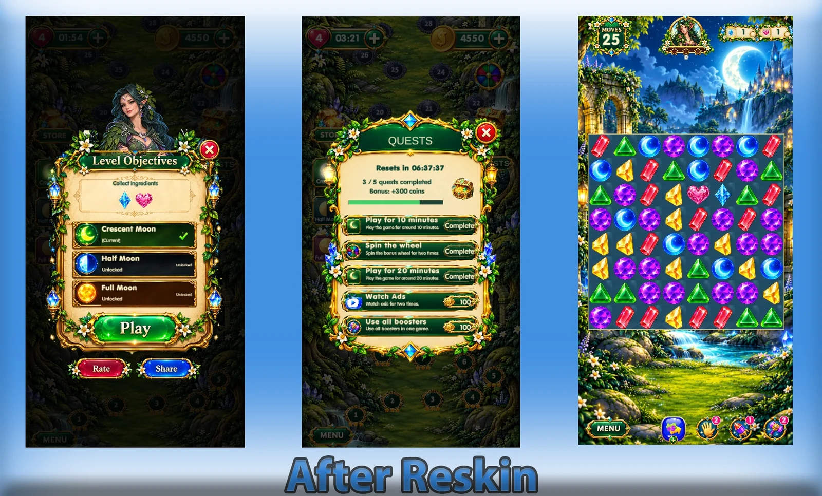
For Gems of Luna, I reworked or replaced backgrounds, maps, crystals, boosters, buttons, panels, the main screen, logo, icons and banner. The comparison images show why that scope matters. The change is not confined to one decorative illustration; it reaches the ordinary panels players use during a session.

Three themes, one recognisable game
The rebuilt presentation uses green, icy-blue and red-orange themes alongside the three difficulty modes. The green imagery brings together vegetation, stonework and water. The blue environments move towards ice and crystal, while the red-orange scenes use volcanic landscapes. They provide visual contrast without needing to explain any of the story’s revelations.
Luna remains recognisable across those changes, while her clothing follows the evolving colour direction. That continuity gives the different environments a common point of reference. The world can change in appearance without every screen feeling like the start of an unrelated game.

The puzzle board still needs to be readable
Detailed fantasy artwork creates a practical challenge: it must not make the puzzle harder to read. I worked on contrast, readability and consistent icon use as part of the rebuild. The frame and background help establish the atmosphere, but the player still needs to distinguish pieces, see the objective and understand the available controls.
The board uses five active crystal colours per level, selected from six available types. Pieces also have different shapes, from triangular and faceted gems to crescent-like forms. The screenshots let readers see those distinctions directly. They are examples of the actual game presentation, not invented gameplay mockups.
Boosters also needed to fit the revised interface. Their functions include extra moves, a free swap, clearing an area and removing a single piece. Decorative treatment should not erase those differences: a useful icon has to communicate an action as well as match the surrounding style.
Everyday panels are part of the world
The quest panel, bonus wheel, daily rewards and level-objective screens are part of the same presentation. I carried the illustrated direction into their borders, buttons and icons rather than treating them as separate utility windows. The newer overview shows objectives, quests and the board side by side.

This is also where artwork and programming overlap. A replacement button still needs to fit its label and respond correctly; a panel needs to leave room for its information. Alongside the visual changes, I worked on map progression, progress and booster saving, and repairs to problematic levels. Those systems are less visible in a promotional image, but they belong to the same rebuild.
Where AI helped—and where the decisions remained
AI tools helped me create illustrations and work through development changes with Codex. That assistance did not mean accepting every result as the final asset. The project still needed a chosen direction and a consistent relationship between its different pieces. More artwork alone would not have answered those design questions.
The content is prepared for the game rather than generated live during play. I also do not want a visual comparison to stand in for player feedback: a redesigned interface is a documented change, not proof that every player prefers it or that the game will be commercially successful.
See the complete transformation
The before-and-after images record where the project has moved. The Gems of Luna project page brings those images together with the gameplay, difficulty progression and illustrated-album system. It also includes the Google Play link if you want to see the Android game for yourself, without revealing the story’s discoveries.
Built with AI. Directed by human.
Leave a Reply